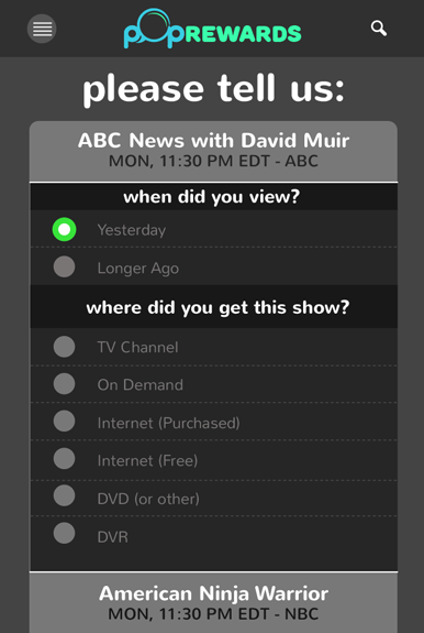
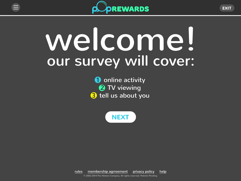
Poprewards was a online survey portal created with Nielsen for third party vendors to funnel traffic through. Much of the functionality was pulled from RewardTV's layout, only this was streamlined for mobile devices. I created everything from the logo to the UX/UI, which was rooted in 3 ultra-bright pastels set against neutral charcoal tones for emphasis. The site was essentially a survey site which measured the viewer's engagement with the ads shown during the content.

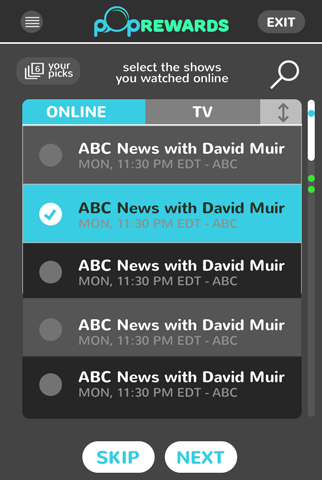
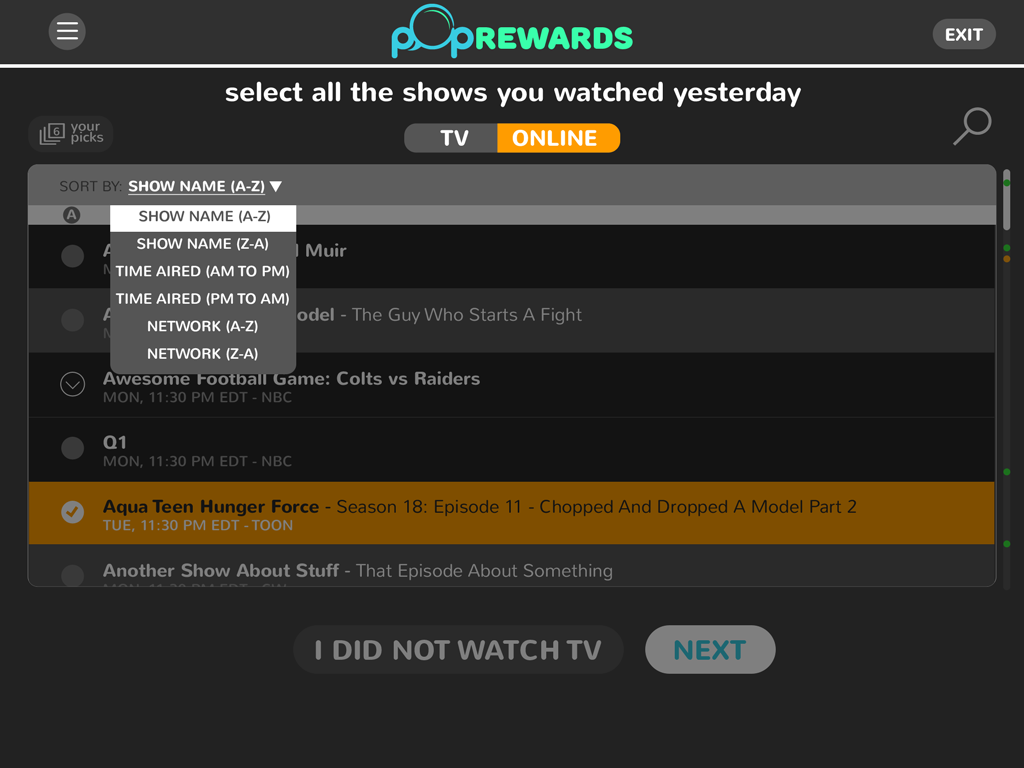
The "Show Selection" screen needed to have multiple sorting options and case states, depending on if the panelist had recently watched online streaming content on their device or not. Also, due to the length of the content table, I added colored-points in the scroll bar that would pin point the location of the user's picks which alleviated the need to scroll incessantly. Everything on this screen was clickable.
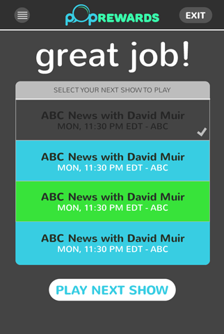
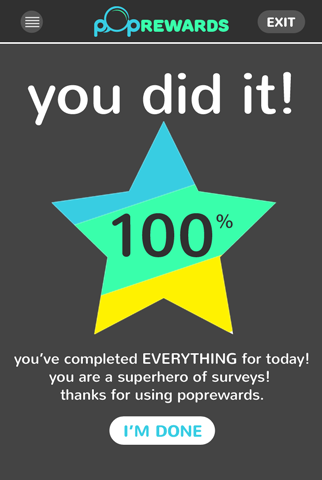
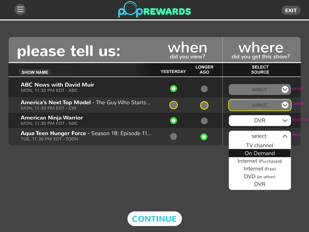
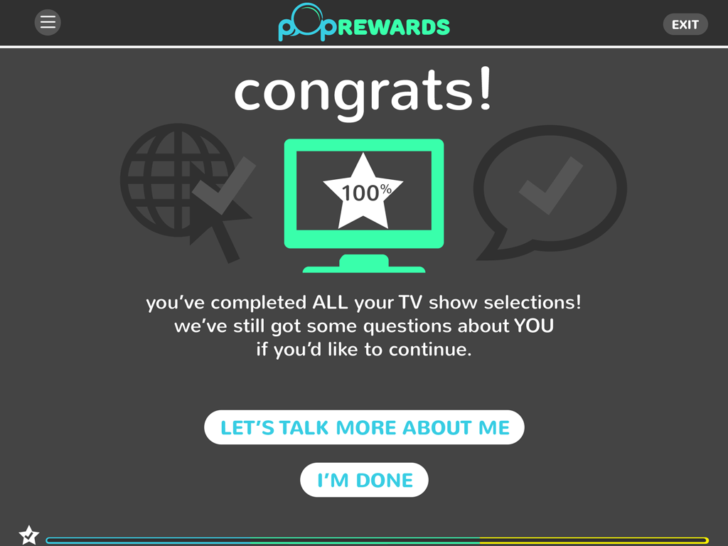
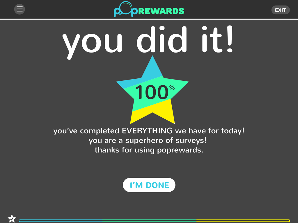
The application was divided into three sections that were color coded (Blue, Green & Yellow) and as the user completed one section, they'd be introduced into the next. One everything was completed for the day (rare cases due to the sheer amount of surveys), the user would get a completion screen. Below isn't the entire experience flow, but some key highlights to convey the process.


Everything was designed for a responsive layout, so that no matter what device you were experiencing the site on, it would reformat cleanly. Below are some examples of the smartphone portrait layouts.